What matters most
- Websites are converging. A study of 227,802 captures of 10,482 websites shows that layouts have moved more than 30 percent closer together since 2007. Generative AI repeats what is most common and pushes the same way.
- Same means forgotten. Visitors judge how a page looks within 50 milliseconds. After that they read roughly a fifth of the text.
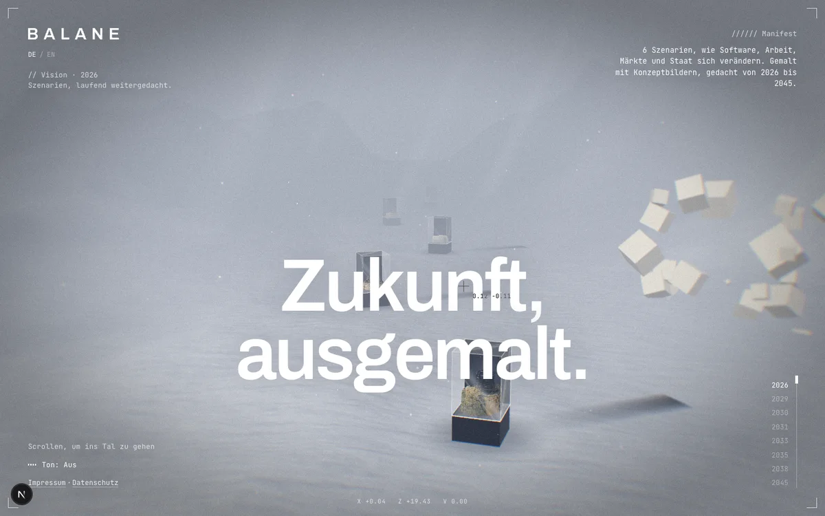
- We developed a website as a place. A valley with display cases you step into. One sentence per scroll step, sound made from code, every sentence also there as plain text.
- It does not fit everywhere. Where people want to get something done, the page should be boring. Where they are meant to discover, it can be a place.
You know this website before it loads. A big image at the top with one line and a button. Below it, three boxes with icons. Then a row of client logos, three quotes with round photos, another button.
That is not just a feeling. Sam Goree and his team at Indiana University compared 227,802 historical captures of 10,482 websites from 2003 to 2019 using computer vision. Since 2007 the sites have become markedly more similar, most of all in layout. The average distance between two sites shrank by more than 30 percent. The researchers point to shared libraries like Bootstrap, templates, and the need to work on every phone.
Since 2019 another reason has joined them. If you generate a website from a prompt today, you get the average of all websites. A research team led by Donghoon Shin wrote in March 2026 that generative AI tends to reproduce the dominant style conventions in its training data. The smoother the generation, the more alike the result.
Fifty milliseconds
None of this would matter if visitors took their time. Gitte Lindgaard and her team showed people homepages for 50 milliseconds. Their verdict on the look closely matched the verdict after 500 milliseconds. Jakob Nielsen analysed 45,237 page views. On an average page, visitors get through at most 28 percent of the words, more realistically 20.
A page that looks like every other page is filed away within 50 milliseconds. After that, people read a fifth of it.
What we tried instead
For Balane Vision, our scenarios on the future of software, work, markets and the state, we did not want a page. We wanted a place.
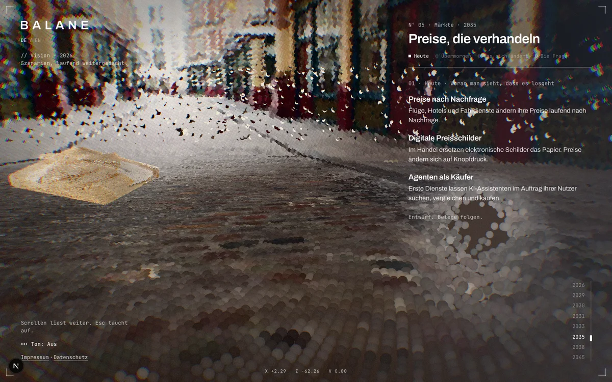
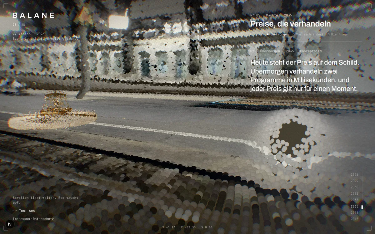
When you open the site, you stand above a valley in the fog. In it stand display cases, one per scenario. Scrolling flies you from case to case. Point at one with the mouse and the future inside wakes up. Today's image falls apart, into sand, into a swarm or blown away by wind depending on the scenario, and reassembles into the image of the day after tomorrow. The last case is locked. Thinking is still going on in there.
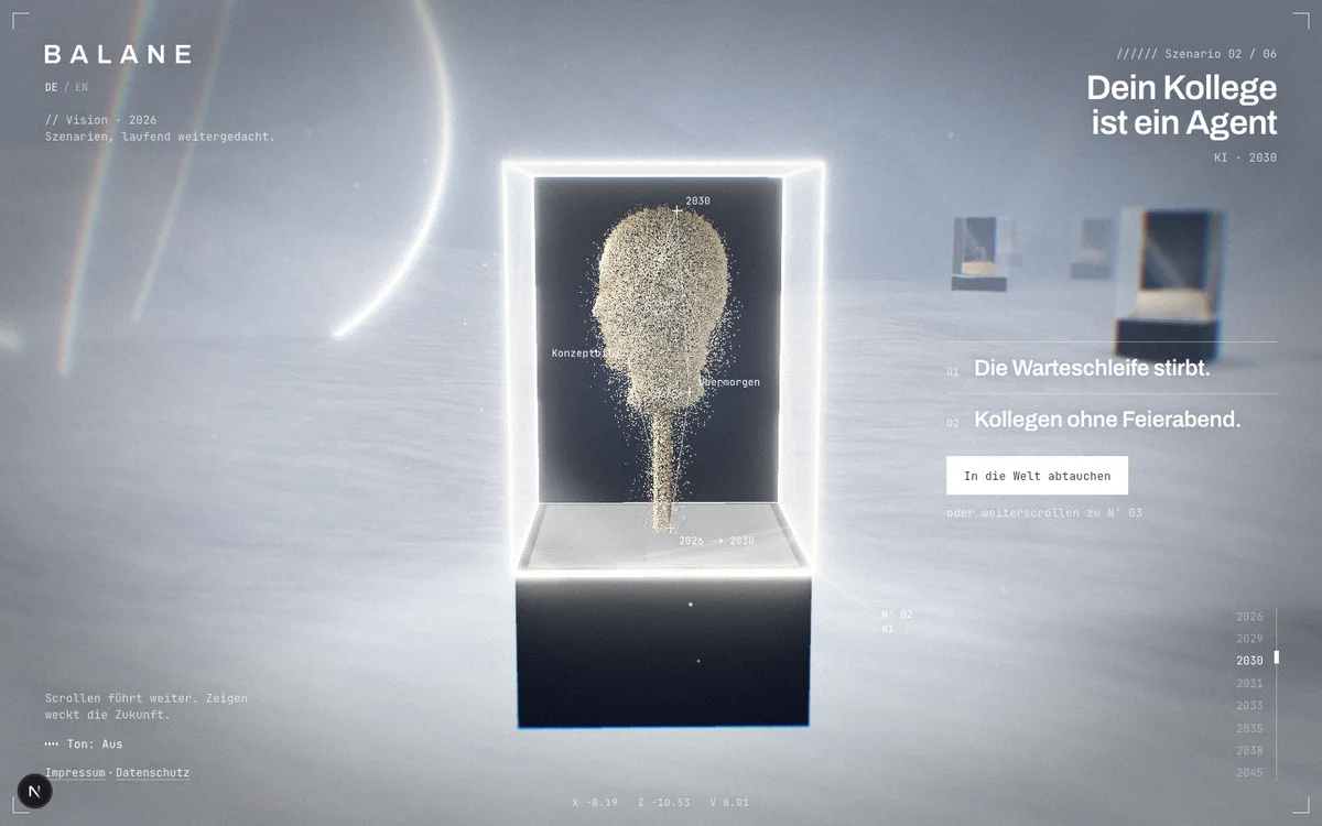
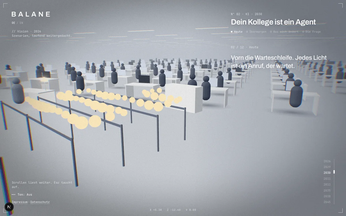
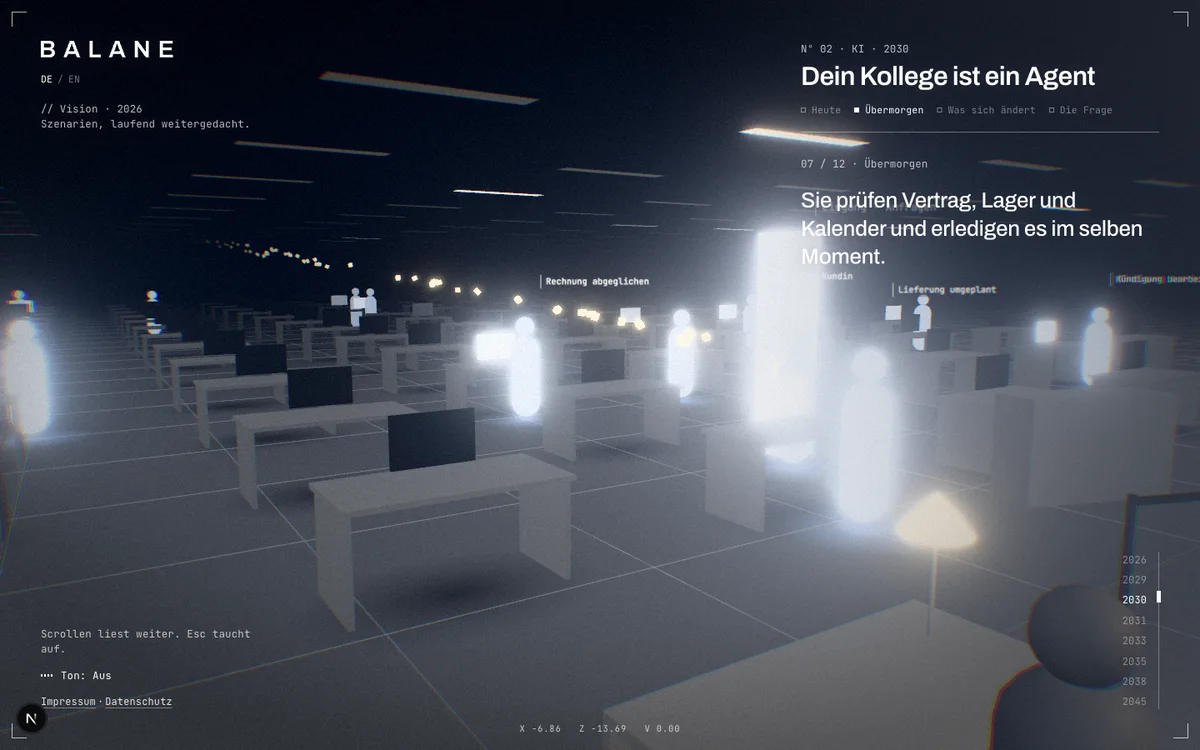
One click and you are pulled into the case. In “Your colleague is an agent” you stand in an open-plan office by day. Up front, the hold queue, every light a call that is waiting. You scroll, evening falls, people go home. Then the lights come back on and agents made of light pick up the requests. In the end one person stays, not to type but to decide. Twelve steps, twelve sentences, one question at the end.
Five rules we stick to
A place, not a page. From a website you remember “something further down”. From a room you remember the case with the head made of sand. That is why every case has its own light, its own fog and its own movement in the air. This is not proven. It is our bet.
One sentence per step. We take over the scrolling. That has a name, scrolljacking, and the Nielsen Norman Group tested it with users in 2023. Their verdict: more pain than benefit. Worst were pages that changed the scroll speed while also asking people to read. Best tolerated were scrolljacks where every step revealed a new, relevant piece of information. That is the rule we follow. Every scroll step shows exactly one sentence, never a paragraph. The Escape key takes you back to the valley at any time.
Surprise, but with rules. Five of the worlds are made of 160,000 points each. Every point has a fixed direction from the eye. When today's market hall turns into a station at night, a point only changes its distance and its colour. The world transforms completely, and you never lose your footing.
Sound made from code. Wind, a low drone, a glass chime when you point, a dull thud when you step in, the murmur of the office. None of these sounds is a file. All of it is generated in the browser from noise and oscillation. And none of it plays until you choose to enter with sound.
Readable for everyone. Behind the world, every sentence sits on the page as plain text. Search engines read it, so do screen readers, and anyone without JavaScript gets it too. If you have reduced motion switched on in your operating system, you get a calmer version: no pull, no flash, no orbiting camera, and the text appears at once. On phones the world renders with less than half the points.
Where this is a bad idea
Almost everywhere. A valley in the fog needs WebGL and a decent graphics chip, and an older laptop gets loud. Nobody wants to fly through fog to download an invoice or book an appointment. The Nielsen Norman Group saw exactly that: people trying to complete a task have far less patience than people browsing.
So the rule is simple. Where people want to get something done, give them a fast, boring page. Where they are meant to discover something, it can be a place. Most companies need both. And most turn both into the same page with three boxes.
Boring where you get things done. A place where you discover.
What now
Balane Vision is a draft. One world is told by hand, five are made from panoramas, and the sources for the scenarios are still to come. The valley is open anyway: balane.vision/en. Best with headphones.
And one question to take with you: which page on your company's site would anyone visit twice of their own free will?
Sources
- Sam Goree, Bardia Doosti, David J. Crandall, Norman Makoto Su: “Investigating the Homogenization of Web Design: A Mixed-Methods Approach”, CHI 2021. doi.org
- Donghoon Shin, Alice Gao, Rock Yuren Pang, Jaewook Lee, Katharina Reinecke, Emily Tseng: “Interrogating Design Homogenization in Web Vibe Coding”, arXiv, 13 March 2026. arxiv.org
- Gitte Lindgaard, Gary Fernandes, Cathy Dudek, J. Brown: study on first impressions of websites, Behaviour & Information Technology 25 (2006), pp. 115 to 126. doi.org
- Jakob Nielsen: “How Little Do Users Read?”, Nielsen Norman Group, 5 May 2008. nngroup.com
- Sara Paul: “Scrolljacking 101”, Nielsen Norman Group, 6 August 2023. nngroup.com
Images. Screenshots of balane.vision. The images in the display cases are concept images generated with Bria. The panoramas of the point worlds come from Poly Haven.